Floating bars can be used to plot many types of data sets. (“Bars” in this usage means “bars”, as Excel calls horizontally oriented bars, as well as “columns”, as Excel calls vertically oriented bars.) In a waterfall chart, floating bars (usually vertical) show how contributing factors affect a cumulative total. In a Gantt chart, horizontal floating bars along a horizontal date scale help program managers plan task start and end dates and durations, and track progress towards completion of these tasks. Floating bars can be useful to show running highs and lows in a data set, such as daily high and low temperatures, stock prices, diastolic and systolic blood pressure readings, etc.
There are numerous ways to create floating bars in an Excel chart. There are so many ways that I should write more than one post, but I’m going to cram them all into this one. I’ve divided the techniques into the following:
- Stacked Column and Bar Charts
- Line Chart Tricks
- Error Bars
- XY Chart Line Segments
Stacked Column and Bar Charts
Stacked column and bar charts are probably the most obvious way to create floating bar charts. This approach is pretty flexible, and allows individual floating bars to be formatted differently, but will require some calculations to get the bars to appear as desired.
Stacked Column Charts (Vertical Bars)
This tutorial will show simple floating columns, stacked floating columns, floating columns that span the horizontal axis, and overlapping floating columns, all using stacked column charts.
Floating Columns
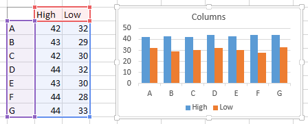
In the data set below, there are several high and low values for the categories in a column chart. The clustered column chart shows the values we want to highlight: we want a floating column to connect each low value to its corresponding high value.
![]()
We achieve this by inserting a column in the worksheet which has a simple formula to calculate the difference between high and low (“Delta” in the table below). Adjusting the data range and changing from clustered to stacked columns shows all we need. The floating column is resting on top of the Low value column.
![]()
A little formatting gives us all we need. The Low series is formatted to be invisible: no border and no fill. The vertical axis has been rescaled to zoom in on the data and remove some of the white space below the floating bars.
You can change the relative width of the columns and gaps between by selecting them and changing the Gap Width property; a Gap Width of 100 means that the gap will be 100% as wide as a bar. I like to use gap widths of 50% to 100%, and I used 75% in most of the charts here.
![]()
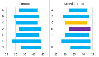
With this technique, each column can be selected (it may take two single clicks) and formatted independently of the rest, for purposes of highlighting one or more specific values.
![]()
The gold and purple colors above may show extreme highlighting, and were selected to clearly show the different colors. In general, subtle highlighting, like the slightly darker shade of point C or the outlined column of point F are usually sufficient.
![]()
Stacked Floating Columns
The stacked column chart allows multiple items to be stacked, since each floating column rests on the lower columns. This table and chart show low, medium, and high values.
![]()
Insert two columns for the two sets of calculations of floating column heights, and plot these with the minimum value.
![]()
As before, format the lowest column to be invisible, and adjust the axis scale, if desired.
![]()
As before, individual columns can be formatted independently of the others.
![]()
Floating Columns Crossing the Horizontal Axis
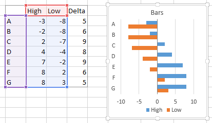
If you want to show floating columns that span negative and positive values, you will encounter problems, as shown by this sample data. It all looks fine when we examine the unstacked columns that show the minimum and maximum values.
![]()
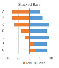
However, when we plot the minimum values and stack the differences on top, we see that the stacking doesn’t work the way we would have liked. Excel plots columns with negative values below the X axis and columns with positive values above the X axis. Even though the Delta begins below the X axis, the Delta column has a positive value, and is plotted starting at zero or at the top of the minimum, if that value is positive.
![]()
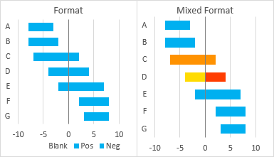
Our simple formulas are not adequate, and we need a different approach. We’ll add three columns to the data sheet: one for the blank columns on which the floating columns will rest, one for whatever part of the floating column is positive (above the X axis), and one for whatever part of the floating column is negative. Using pseudo-references, the formulas we need are:
Blank:  =IF(High<0,High,IF(Low>0,Low,0))
  Pos:  =IF(High>0,High-MAX(Low,0),0)
  Neg:  =IF(Low<0,Low-MIN(High,0),0)
When we plot these values, we get the floating columns spanning the ranges we expect. Note that the floating columns may consist of two pieces, one (orange) below and one (blue) above the X axis, if necessary separated from the axis by the blank series (shown gray in the chart below).
![]()
As always, format the blank series to be blank (no border and no fill), and format the floaters as desired.
![]()
As before, individual floating columns can be formatted independently; the positive and negative portions can be formatted the same or differently.
![]()
Overlapping Floating Columns
You may want to show two sets of floating columns. For example, you may want to compare high and low temperatures for a set of dates with the average historical high and low temperatures for those dates. The way to handle this is to have one set of data on the primary axis, and the other set on the secondary axis.
The table and chart below show two sets of high and low values. The blue will eventually be shown on the primary axis and the orange on the secondary.
![]()
Insert two columns in the sheet, to capture the differences between high and low in the two sets of data. Here are the low and delta of each set in a stacked column chart.
![]()
Here is the same stacked column chart, with the orange series moved to the secondary axis. Each axis has its own Gap Width setting. Here I’ve used 50 for the primary axis (blue columns in back), and 150% for the secondary axis (orange columns in front).
![]()
More formatting: Hide the low columns (no border or fill) and adjust the Y axis. Also, delete the secondary vertical axis and if present the secondary horizontal axis. The chart will keep the series for each axis separate (so they have separate gap widths and so they don’t go stacking on each other), but will plot them on the primary axis scales.
![]()
Individual columns can always be formatted separately.
![]()
Stacked Bar Charts (Horizontal Bars)
The techniques described above for Vertical Column Charts work the same for Horizontal Bar Charts. This tutorial will show simple floating bars, stacked floating bars, floating barsthat span the vertical axis, and overlapping floating bars, all using stacked bar charts.
Floating Bars
In the data set below, there are several high and low values for the categories in a bar chart. The clustered bar chart shows the values we want to highlight: we want a floating bar to connect each low value to its corresponding high value.
![]()
To get the vertical axis labels in your chart to be in the same top-to-bottom order as in the worksheet, follow the approach described in Why Are My Excel Bar Chart Categories Backwards? and in Excel Plotted My Bar Chart Upside-Down.
Note also that in an Excel Bar Chart the vertical axis is the X axis (for the independent variable), and the horizontal axis is the Y axis (for the dependent variable). This confuses a lot of people, so I usually stick to “horizontal” and “vertical” instead of “X” and “Y”.
We achieve this by inserting a column in the worksheet which has a simple formula to calculate the difference between high and low (“Delta” in the table below). Adjusting the data range and changing from clustered to stacked bars shows all we need. The floating bar is resting to the right of the Low value bar.
![]()
A little formatting gives us all we need. The Low series is formatted to be invisible: no border and no fill. The horizontal axis has been rescaled to zoom in on the data and remove some of the white space to the left of the floating bars.
You can change the relative width of the bars and gaps between by selecting them and changing the Gap Width property; a Gap Width of 100 means that the gap will be 100% as wide as a bar. I like to use gap widths of 50% to 100%, and I used 75% in most of the charts here.
With this technique, each bar can be selected (it may take two single clicks) and formatted independently of the rest, for purposes of highlighting one or more specific values.
![]()
Stacked Floating Bars
The stacked bar chart allows multiple items to be stacked, since each floating bar rests on the lower bars. This table and chart show low, medium, and high values.
![]()
Insert two columns for the two sets of calculations of floating bar lengths, and plot these with the minimum value.
![]()
As before, format the lowest bar to be invisible, and adjust the axis scale, if desired.
As before, individual bars can be formatted independently of the others.
![]()
Floating Bars Crossing the Vertical Axis
If you want to show floating bars that span negative and positive values, you will encounter problems, as shown by this sample data. It all looks fine when we examine the unstacked bars that show the minimum and maximum values.
![]()
However, when we plot the minimum values and stack the differences on top, we see that the stacking doesn’t work the way we would have liked. Excel plots bars with negative values to the left of the X axis and bars with positive values to the right of the X axis. Even though the Delta begins to the left of the X axis, the Delta bar has a positive value, and is plotted starting at zero or at the right end of the minimum, if that value is positive.
![]()
Our simple formulas are not adequate, and we need a different approach. We’ll add three columns to the data sheet: one for the blank bars on which the floating bars will rest, one for whatever part of the floating bar is positive (above the X axis), and one for whatever part of the floating bar is negative. Using pseudo-references, the formulas we need are:
Blank:  =IF(High<0,High,IF(Low>0,Low,0))
  Pos:  =IF(High>0,High-MAX(Low,0),0)
  Neg:  =IF(Low<0,Low-MIN(High,0),0)
When we plot these values, we get the floating bars spanning the ranges we expect. Note that the floating bars may consist of two pieces, one (orange) to the left of and one (blue) to the right of the X axis, if necessary separated from the axis by the blank series (shown gray in the chart below).
![]()
As always, format the blank series to be blank (no border and no fill), and format the floaters as desired.
As before, individual floating bars can be formatted independently; the positive and negative portions can be formatted the same or differently.
![]()
Overlapping Floating Bars
You may want to show two sets of floating bars. For example, you may want to compare high and low temperatures for a set of dates with the average historical high and low temperatures for those dates. The way to handle this is to have one set of data on the primary axis, and the other set on the secondary axis.
The table and chart below show two sets of high and low values. The blue will eventually be shown on the primary axis and the orange on the secondary.
![]()
Insert two columns in the sheet, to capture the differences between high and low in the two sets of data. Here are the low and delta of each set in a stacked bar chart.
![]()
Here is the same stacked bar chart, with the orange series moved to the secondary axis. Each axis has its own Gap Width setting. Here I’ve used 50 for the primary axis (blue bars in back), and 150% for the secondary axis (orange bars in front).
If you used the Upside-Down-Bar-Chart trick to plot the primary vertical axis labels in the same order that they appear in the worksheet, you’ll have to display the secondary vertical axis and apply the same trick to it.
![]()
More formatting: Hide the low bars (no border or fill) and adjust the Y axis. Also, delete the secondary horizontal axis and if present the secondary vertical axis. The chart will keep the series for each axis separate (so they have separate gap widths and so they don’t go stacking on each other), but will plot their values using the primary axis scales.
Individual bars can always be formatted separately.
![]()
Line Chart Tricks
Excel’s line charts have a few built-in features that can be used to generate floating columns. These include Up-Down Bars and High-Low Lines, which can be combined to create Open-High-Low-Close (OHLC) Stock Charts, and also Drop Lines. Being tied into line charts, these features can only be used to generate vertical floating bars.
Up-Down Bars
Up-Down Bars connect the values of a chart’s first line chart series and last line chart series with floating bars. There are actually two sets of bars: Up Bars, which connect a lower first value to a higher last value (the value goes Up), and Down Bars, which connect a higher first value to a lower last value (the value goes Down).
Floating Columns
For simple floating bars, you need to plot two data series in a line chart.
![]()
In Excel 2013, click the Plus icon next to the chart, and check the Up-Down Bars box; alternatively, on the Chart Tools > Design ribbon tab, click the Add Chart Element dropdown, and select Up-Down Bars. In Excel 2007 or 2010, on the Chart Tools > Layout ribbon tab, use the Up/Down Bars dropdown.
The chart below specifically has Down Bars, since all of the values in the last series are lower than all those of the first series.
![]()
Unlike the Stacked Column Chart technique, we need to carry out no calculations to determine how tall the floating bars have to be, and we don’t need a hidden set of bars on which to balance the floating bars.
Now apply a little formatting. Format the lines to have no markers and no lines, and give the up-down bars a suitable fill color.
You can change the relative width of the up-down bars and gaps between by selecting them and changing the Gap Width property of one of the line chart series; a Gap Width of 100 means that the gap will be 100% as wide as a bar. I like to use gap widths of 50% to 100%, and I used 75% in most of the charts here.
![]()
Mixed Formats: Up vs. Down
You can’t format individual up-down bars with their own colors, but since there are Up Bars and Down Bars, you can at least format some with one color and the rest with another color.
In the data below I’ve switched the First and Last values for points C and D. The line series cross, so the Last series is greater than the First for these points.
![]()
When Up-Down Bars are added, the black Down Bars for most of the points are replaced by Up Bars for points C and D.
![]()
In this way we can assign different formats to highlight selected points.
![]()
Up-Down Bars: First to Last
As mentioned before, Up-Down Bars connect the first line chart series to the last, ignoring values in between. In this data set, the earlier First and Last series have had intermediate series Second and Third inserted between them.
![]()
When Up-Down Bars are inserted, they connect First and Last, ignoring any values of Second and Third that may extend beyond First and Last.
![]()
Floating Columns Crossing the Horizontal Axis
When dealing with the Stacked Column Chart technique, if you recall, we couldn’t simply use a floating column to span values below and above the horizontal axis. Let’s try this with Up-Down Bars.
![]()
The lines show where we want the bars to appear, and when we add the Up-Down Bars…
![]()
… they go where we want. Again, no calculations required.
Overlapping Floating Columns
We can use Up-Down Bars to generate overlapping sets of floating bars, using primary and secondary axis groups. Here are two pairs of values plotted in a line chart. The Blue series are plotted on the primary axis, and the Orange series on the secondary. The secondary vertical axis has been deleted so that all values are plotted along the primary axis.
![]()
One of the primary series is selected, and Up-Down Bars are added.
![]()
One of the secondary series is selected, and again Up-Down Bars are selected.
![]()
The Up-Down Bars are formatted with different colors, and the line chart series are formatted to use different gap widths as well as no lines and no markers.
![]()
As before, individual bars can be formatted as Up Bars among a field of Down Bars. In the table below, first and last values have been switched for points C and D for both primary and secondary series. The line chart series cross…
![]()
… and the bars have been formatted differently to highlight points C and D.
![]()
High-Low Lines
High Low Lines connect the highest and lowest values of a chart’s line chart series using vertical lines. The order of series makes no difference to these lines.
Floating Columns
For simple floating bars, you need to plot two data series in a line chart.
![]()
In Excel 2013, on the Chart Tools > Design ribbon tab, click the Add Chart Element dropdown, click Lines, and select High-Low Lines. In Excel 2007 or 2010, on the Chart Tools > Layout ribbon tab, use the Lines dropdown, and select High-Low Lines.
![]()
Format the plotted line series with no lines and no markers to hide them, and you’re left with boring black vertical lines.
![]()
In classic versions of Excel (2003 and earlier) you had limited ability to format such lines, but Excel 2007 introduced the ability to make the lines pretty much as wide as desired. The high-low lines in the chart below are 13.5 points thick, and look a lot like the floating columns produced by the other techniques above.
![]()
These lines can be assigned colors and thicknesses, but are not actually rectangular shapes, so they don’t have both border and fill colors.
High-Low Lines: Highest to Lowest
High-Low Lines work by connecting the lowest and highest values at each category. It doesn’t matter where in the sequence the high or low value occurs. In the data below, the highest (blue) and lowest (red) values are highlighted: they are distributed among the columns of data.
![]()
When High-Low Lines are added, they connect high and low, regardless of which series includes the extremes.
![]()
Note that no values are located above or below the formatted High-Low Lines.
![]()
Floating Columns Crossing the Horizontal Axis
The Stacked Column Chart technique required tricky formulas to allow a floating column to span values below and above the horizontal axis, while the Up-Down Bar approach did not. Let’s try this with High-Low Lines.
![]()
The lines show where we want the bars to appear, and when we add the High-Low Lines…
![]()
… and format them…
![]()
… they go where we want. As with Up-Down Bars, it works easily, no calculations required.
Overlapping Floating Columns
We can use High-Low Lines to generate overlapping sets of floating bars, using primary and secondary axis groups. Here are two pairs of values plotted in a line chart. The Blue series are plotted on the primary axis, and the Orange series on the secondary. The secondary vertical axis has been deleted so that all values are plotted along the primary axis.
![]()
A primary axis series is selected, and High-Low Lines are added.
![]()
A secondary axis series is selected, and again High-Low Lines are selected.
![]()
The High-Low Lines are formatted with different colors and line widths (13.5 and 8 pts), and the line chart series are formatted to use no lines and no markers.
![]()
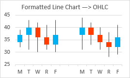
Stock Charts
Up-Down Bars and High-Low Lines were probably introduced into Excel to enable Open-High-Low-Close type Candlestick stock charts. Open and Close are the First and Last series from the Up-Down Bars examples above, and High and Low are, well, High and Low from the High-Low Lines examples. When applied together with the data columns in the appropriate order, simple line charts can be formatted into OHLC charts.
Line Chart Plus
Here is a table with two weeks of stock data and the corresponding line chart.
![]()
Add High-Low Lines…
![]()
… add Up-Down Bars…
![]()
… and do a little formatting to create a candlestick chart. Use no markers or lines for the plotted series, and use your favorite colors and gap width for the Up-Down Bars. I always forget whether black or white bars signify up or down, and green and red make a bad combination for color vision deficient viewers, so I usually use blue for up and red or orange for down.
![]()
In “Classic” versions of Excel (97 through 2003), the line chart with High-Low Lines and Up-Down Bars was smart enough to recognize itself as a stock chart type, but since Excel 2007, such a chart only considers itself a line chart.
In Excel 2007 and later you cannot combine a stock chart with any other chart type, so you can’t add another series to show how, say, some market index varies in comparison. But you can make your stock chart using a line chart like I did here, then add whatever index lines you want.
Built-In OHLC
Using the same data set, you can directly insert an OHLC stock chart.
![]()
A little formatting, and it’s identical the the line chart stock chart above.
![]()
The only difference is that the “official” stock chart can’t be combined with any other data.
Drop Lines
Drop Lines are lines that drop from data points to the horizontal (category) axis in line charts and area charts. Each line or area series in a chart can have Drop Lines, and every point in a series with Drop Lines has a Drop Line. Drop Lines cannot produce floating bars, since they by definition start at the axis, but they are related to these other techniques, and it’s useful to know about them, even if you use them only infrequently.
Column Chart
Here is the simple data and line chart we’ll use for our Drop Lines example.
![]()
In Excel 2013, on the Chart Tools > Design ribbon tab, click the Add Chart Element dropdown, click Lines, and select Drop Lines. In Excel 2007 or 2010, on the Chart Tools > Layout ribbon tab, use the Lines dropdown, and select Drop Lines. The lines are thin vertical black lines.
![]()
Like any lines in Excel 2007 and later, we have great flexibility in how we want to format Drop Lines. Here I’ve hidden the line series (no markers and no lines) and I’ve given the Drop Lines a width of 13.5 points and a blue/cyan line color, to produce what appears to be a standard column chart.
![]()
Error Bars
Line Charts with Error Bars
Line charts can have vertical Error Bars, oriented upwards or downwards of the data points, or both. This technique will work with column and area charts as well, but it’s easier to illustrate with line charts.
Floating Bars
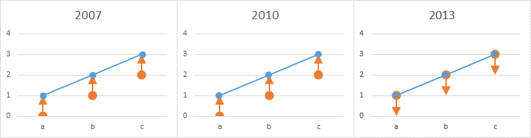
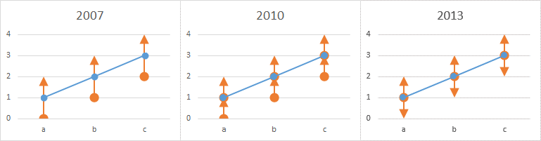
We can use Error Bars with custom lengths as floating bars. Here we have high and low values, shown together in a line chart. There is another worksheet column with formulas that compute the differences (Delta).
![]()
We only need one of the line chart series for our Error Bars. We can plot the High values, and use Minus Error Bars for our floating bars (left), or we can plot the Low values, and use Plus Error Bars for our floating bars (right).
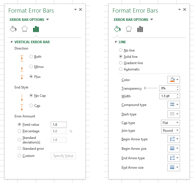
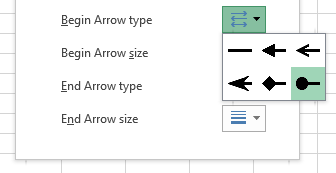
To assign custom values for error bars, first add Error Bars (in Excel 2013, use the Plus icon floating beside the chart; in Excel 2007 or 2010, use the Error Bars control on the Chart Tools > Layout tab). Then under Error Bar Values in the formatting dialog or task pane, select Custom and click Select Values. In the dialog, click in the Plus or Minus box, and select the range of cells with the Error Bar values. If you are only using one of the boxes, you have to explicitly type a zero in the other box, or Excel will not recognize your selection. Stupid Excel.
![]()
Hide the line chart series (format with no lines or markers), and format the Error Bar lines to use No End Caps, and appropriate width (here I’ve used 13.5 points) and line color.
![]()
Stacked Floating Bars
Here are High, Mid, and Low values along with the computed differences between adjacent points (Upper and Lower). We want stacked floating bars showing the distance between Low and Mid and between Mid and High.
![]()
“Aha!” you say, “I’m way ahead of you this time.” Plot the Mid series with Plus and Minus Error Bars (below left), then format the Error Bars as above (below right). But wait, the Plus and Minus Error Bars cannot be independently formatted?
![]()
Too bad, but it’s not a big deal. We just need two series, one for each independently formatted set of Error Bars. Here, I’ll plot the High and Low series.
![]()
I’ll add Minus Error Bars to the High series, then Plus error bars to the Low series.
![]()
Then I’ll hide both series and format the Error Bars.
![]()
Floating Columns Crossing the Horizontal Axis
When using Stacked Column Charts to generate floating bars, if you recall, we couldn’t simply use a floating column to span values below and above the horizontal axis. But Up-Down Bars and High-Low Lines didn’t care if they crossed the axis. Let’s try this with Error Bars, using the same High and Low values as before.
![]()
So we try the High series with Minus Error Bars, and the Low series with Plus Error Bars. Both allow the Error Bars to cross the category axis.
![]()
Format away.
![]()
Error Bars as Drop Lines
Error Bars can also be used to create Drop Lines. Here’s a simple line chart using the Drop Lines data from above.
![]()
Instead of adding Drop Lines, we can add Error Bars, choose the Minus direction, and a Percentage Value of 100.
![]()
No lines and markers for the data series, no end caps but thick lines and a nice line color for the Error Bars.
![]()
XY Scatter Charts with Error Bars
As with the line charts in the preceding section, XY scatter charts can support vertical Error Bars. They can also support horizontal Error Bars. Every trick that works with line chart vertical Error Bars will also work with XY scatter chart vertical and horizontal Error Bars.
Vertical Floating Bars
Okay, we already know it’s going to work, but let’s run through the exercise for completeness. Here is the same High and Low data as before, with numeric rather than alphabetic X values.
![]()
Plot the High series with Minus Error Bars or the Low series with Plus Error Bars…
![]()
… a little formatting, and it’s the same as with the line chart Error Bars.
![]()
Horizontal Floating Bars
Plot the same data, but exchange X and Y in the chart.
![]()
Plot the High series with Minus horizontal Error Bars or the Low series with Plus horizontal Error Bars.
![]()
The same as before, but horizontal.
![]()
Vertical Drop Lines
We can use vertical error bars on an XY scatter chart to create drop lines. Same data as before, but in a scatter plot.
![]()
Add Minus Error Bars, using the Percentage Value option, and 100%.
![]()
Hide the plotted series and format the Error Bars.
![]()
This is the answer to two common Excel-related forum questions:
- How do I get Drop Lines on my scatter plot?
- How can I get a column chart on a value X axis?
Horizontal Drop Lines
Taking the previous data, but switching X and Y…
![]()
Add horizontal Minus Error Bars, using the Percentage Value option, and 100%, then hide the plotted series and format the Error Bars.
![]()
XY Chart Line Segments
A very powerful technique for creating floating bars is using XY chart series line segments. You can make vertical and horizontal floating bars, but you are not constrained to these simple orientations. You can position endpoints of your bars pretty much anywhere in you chart, so the possibilities are limitless. In addition, line segments can be independently formatted, even within the same series of points.
I will use simple examples to illustrate the technique, then set you free.
Floating Columns and Bars
Here are plots showing the same High and Low values for vertical and horizontal floating bars.
![]()
XY chart segments connect points in the same series, not in different series as in several of the techniques covered so far. So we need to arrange the data to plot points in one series, not two.
![]()
We could use that data, but then we’d have to format the in-between (slanted) segments to use no line color. Pretty tedious after the second or third line segment. But if we insert a blank row between each pair of values, Excel will not plot a line segment across the gap, so formatting will be easy.
![]()
As with the previous techniques using thick formatted lines, we’ll start with out XY scatter chart, and thicken up the lines. The vertical lines are 13.5 points, the horizontal lines, 10.5 points. But we’ve hidden the markers; why are there circles at the endpoints?
![]()
It turns out that Excel’s richly formattable lines have three different “Cap Type” styles. I’ve illustrated them here with small red markers to illustrate their appearance. The Round Cap style has a circular end shape extending beyond the endpoint of the line segment, where the marker is at the center of the circle. The Square Cap style has a square end end shape extending beyond the endpoint of the line segment, with the markers at the center of the square. And the Flat Cap stops exactly at the end of the segment, with the line squared off right at the marker.
![]()
We didn’t have to worry about this with the Error Bars, Drop Lines, and High-Low Lines, because their default “Cap Type” is Flat Cap.
The default “Cap Type” for chart series line segments is Round Cap, which makes for nice-looking polygonal plotted lines. But for floating bars, we most likely will want to use the Flat Cap style.
Here are floating bars using vertical and horizontal XY segments and the Flat Cap style.
![]()
We can select individual line segments (click once to select the entire series, and again to select the particular line segment), and format them independently of the others.
![]()
Stacked Floating Columns and Bars
Here is our stacked floating bar data, plotted as separate series for vertical and horizontal floating bars.
![]()
Here is the same data rearranged to facilitate XY series line segments for vertical and horizontal floating bars, including the blank rows between pairs of points.
![]()
Hide the markers and fatten up the lines, and we’ve got stacked floating bars.
![]()
As before, individual bars (line segments) can be formatted independently of the rest.
![]()
Summary
Here is a summary of the Floating Bar techniques discussed in this article.
Most techniques provide vertical bars, a couple horizontal bars, and XY Scatter Line Segments alone produce bars at any orientation.
A few techniques provide actual rectangular bars, which have a border and fill, while many approximate the appearance of a rectangle with thick line segments.
Some techniques allow individual bars in a set to be formatted independently, and some allow easy creation of stacked bars through the use of multiple series.
Stacke column and bar charts do not permit floating bars to cross the category axis, at least not without using tricky formulas to split bars into positive and negative components. The other techniques allow floating bars above, below, or across the axis.
![]()
The post Floating Bars in Excel Charts appeared first on Peltier Tech Blog.


 , and I must admit I know very little about it.